Salt House
The brief:
Salt House came to us with a dream and a dare. They weren’t looking for a polite rebrand or a tidy little refresh. They wanted something that turned heads, made noise, and stuck around in people’s minds long after the party ended.
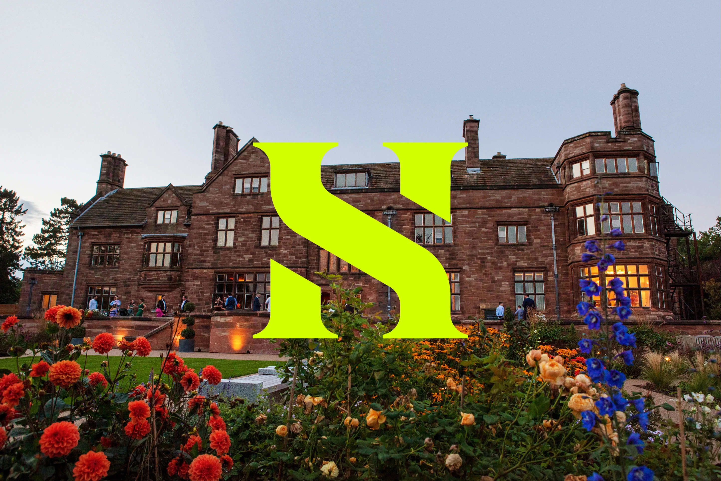
The venue itself is a masterpiece of contradictions; period architecture dressed in modern attitude, elegance with a wild streak. Our challenge was to build a brand that could live up to that. Something fearless enough to match the character of the building and the people who bring it to life.
Salt House needed an identity that could attract couples and creators who crave experiences that defy tradition. They wanted to shout about who they were, without ever losing their style. In short, they wanted to be the go-to destination for the bold, the brave, and the beautifully unconventional.
The Solution:
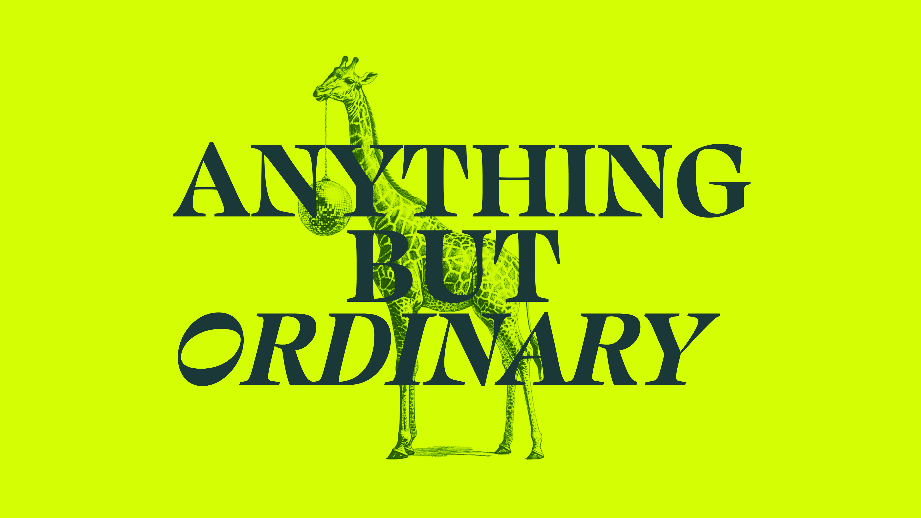
We built the Salt House brand from the ground up with one rule in mind: nothing ordinary survives. The new identity blends refined design with a touch of rebellion, elegance with edge. Every detail was crafted to speak directly to the audience, for those who want to stand out, not fit in.
The tone of voice became the heartbeat of the brand: witty, confident, bold and human. The visuals followed suit with striking type, unapologetic colour, and imagery that oozes personality. We created a design system that looks just as good on a giant billboard as it does on a wedding invite or an Instagram story.
The end result feels like Salt House itself by being sophisticated but never stiff, a little wild but always considered. It’s a brand that smiles while it breaks the rules.
BRAND IDENTITY
SOCIAL
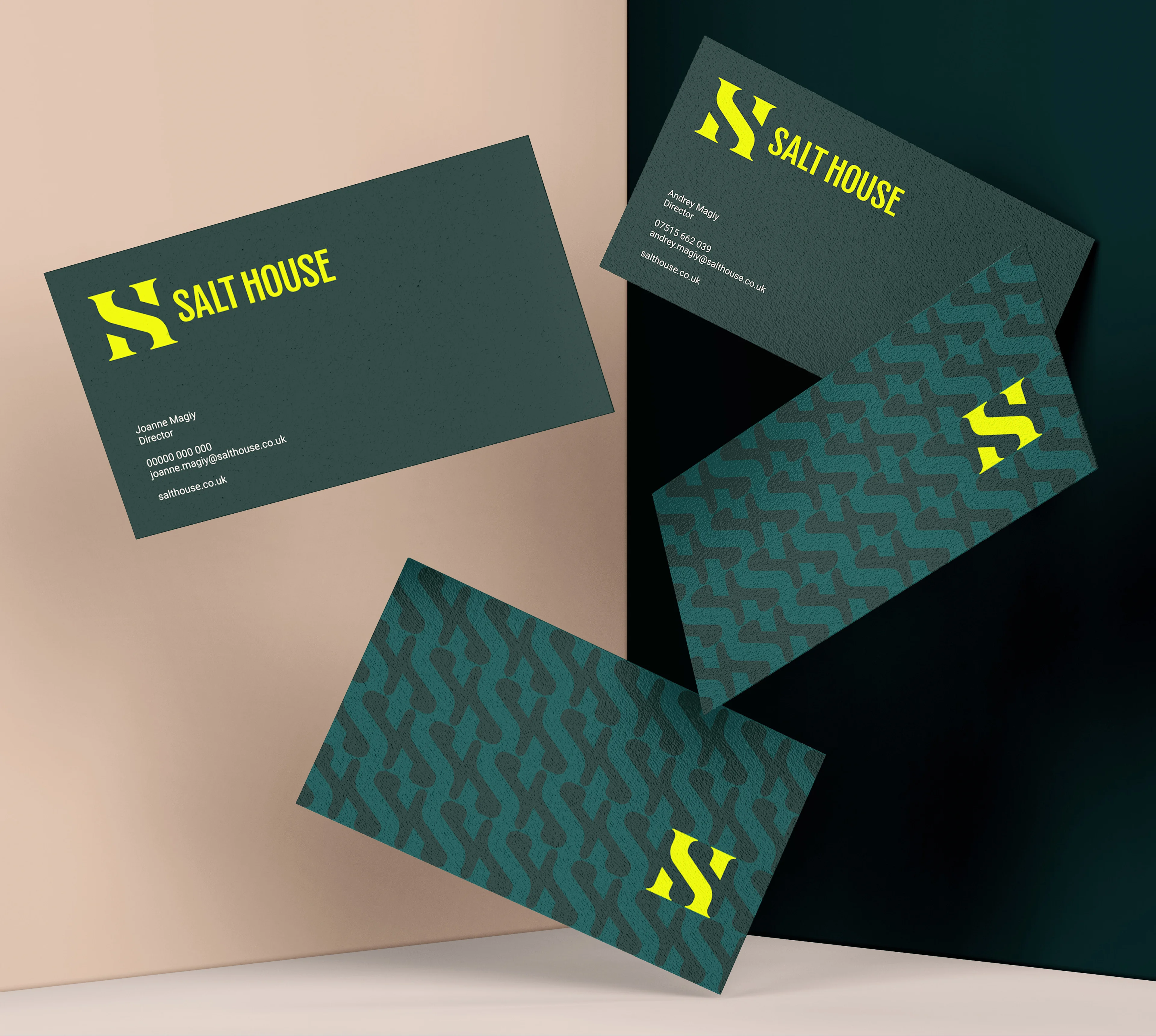
We started with simplicity and gave it swagger. The Salt House logotype is clean and architectural, with just enough character to keep it memorable. Paired with a geometric logomark inspired by the venue’s structure, the two elements work in perfect balance — one bringing strength, the other bringing style.

Logotype and logomark:
The logo system is versatile enough to flex across every touchpoint. From large-scale signage to social icons, it keeps its presence without losing clarity. We designed it to breathe, to feel effortless, to never scream for attention but somehow always get it anyway.
The logomark can stand alone, strong and confident, while the full wordmark carries an air of timeless class. It’s modern elegance with a playful smirk.

Colours:
Salt House doesn’t do subtle. The colour palette leads with confidence, a flash of electric green against a backdrop of deep, grounded tones. It’s a perfect reflection of the venue itself: classic bones with a modern pulse. That flash green is pure personality. It captures the fearless energy of the people who choose Salt House, bold, bright, and unapologetically alive. The darker greens add depth and sophistication, anchoring the palette with calm, collected charm. Then there’s Anything But Beige — soft, warm, and quietly defiant, bringing balance without ever slipping into boring.
The secondary colours expand the story. Rich, vibrant tones that can flex depending on mood or moment. They bring warmth when needed, or cool composure when the design calls for it. There are no strict rules here, only good instincts. At Salt House, colour isn’t decoration. It’s emotion. It’s attitude. And just like the venue itself, it’s open to a little creative chaos.


Brand imagery and texture:
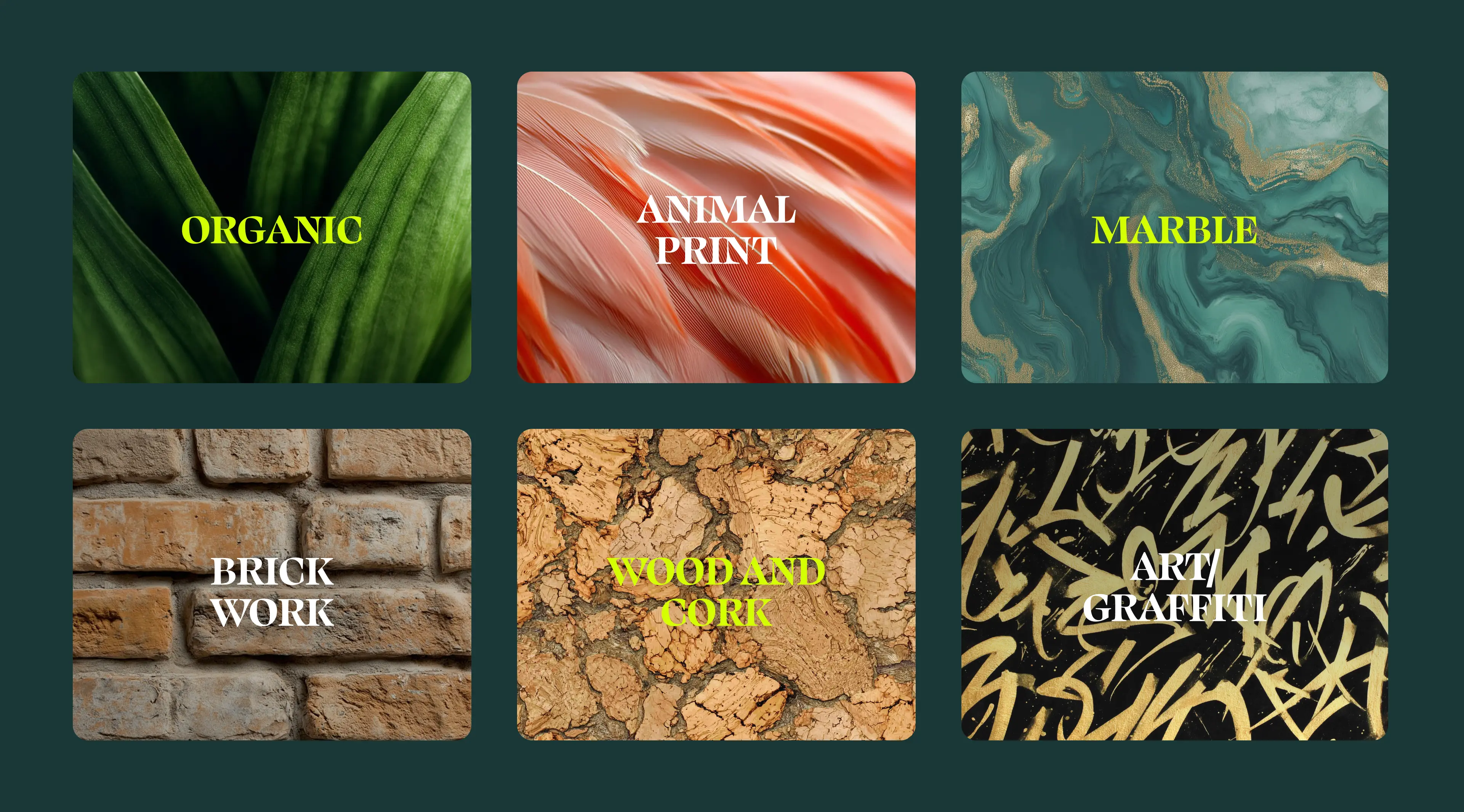
The supporting graphics, herringbone patterns, organic textures and playful line work weave through the materials to create rhythm and cohesion. Every visual element has personality and purpose. Elegant one moment, rebellious the next. Always unmistakably Salt House.
The brand visuals play with contrast and character with bold monochrome illustrations that wink at tradition. Patterns are built from the logo’s structure, and textures that echo the venue’s architecture. While the giraffe holding a disco ball is a nod to the brand’s offbeat humour and fearless originality. It’s the perfect symbol for a place that knows how to have fun without losing an ounce of class.
Brand guidelines:
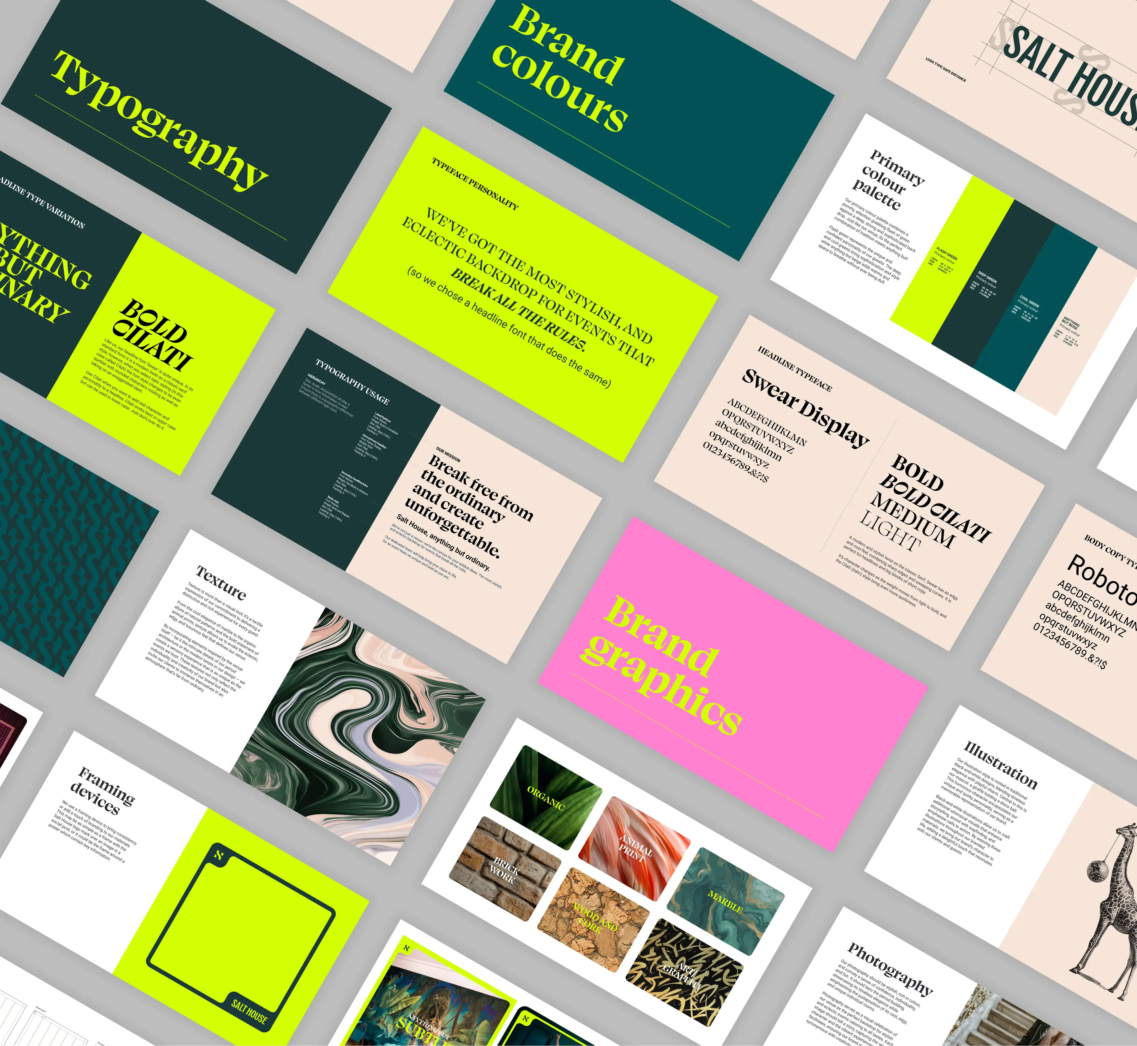
We built a set of brand guidelines that don’t feel like a rulebook, but a toolkit for expression. They lay out the structure of the brand, the colours, the type, the tone while leaving space for creativity to breathe.
Every section was designed to empower the team behind the venue. The photography, the copy, the social posts which are all guided by one central truth: the brand should feel bold, honest, and human. The guidelines keep that energy intact no matter who’s creating the work.
It’s clarity without constraint, and confidence without control. A visual and verbal playbook that makes sure the brand always walks its talk.


Typography:
If Salt House were a voice, it would sound smooth, witty, and impossible to ignore. The typography had to capture that. For headlines, we chose Swear Display which is a modern serif with a sharp tongue and elegant posture. It carries a quiet authority while still being full of personality. Its Cilati italic variation adds a touch of drama and mischief, perfect for moments that need a wink.
Supporting it is Roboto, a clean and contemporary sans-serif that grounds the more expressive moments. It’s the rhythm guitar to Swear’s lead solo being steady, balanced, and confident.
Together, they create tension and harmony, sophistication and playfulness. Every headline feels like a statement, every paragraph feels like a conversation.

Photography:
The photography brings everything into focus. It’s not just about showing the venue; it’s about showing the feeling.
Salt House is all about energy, the laughter echoing through hallways, the glow of candlelight on old brick, the champagne caught mid-splash. The photography captures that magic in real, human moments.
Each shot is drenched in personality: confident, rich in texture, and beautifully lit. We wanted viewers to feel like they were already there standing in the middle of a story still unfolding.
It’s not a photo library. It’s a celebration of what happens when style, soul, and storytelling collide.
Social Templates:
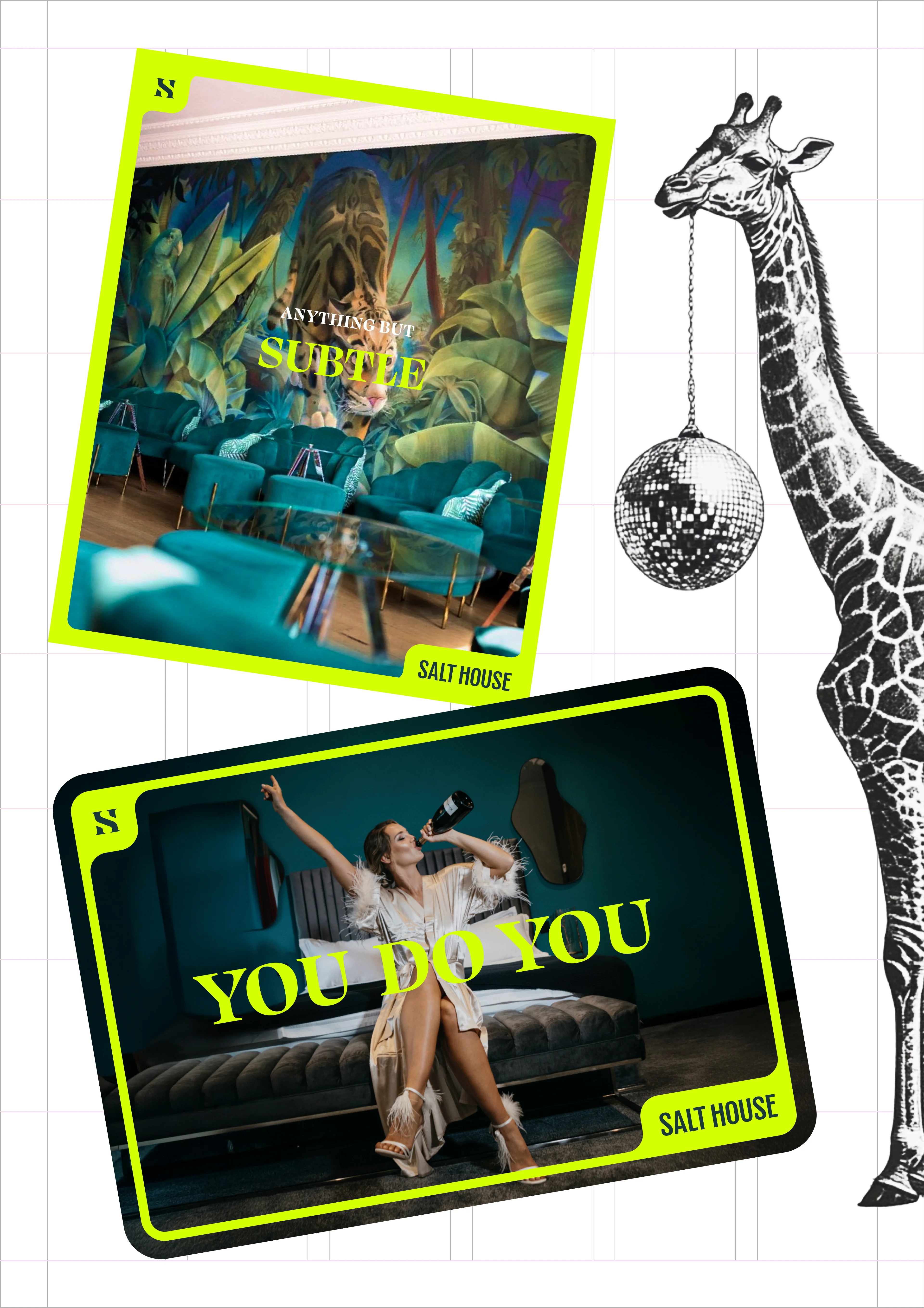
Salt House lives loud online. Their social templates were designed to feel like the brand speaking directly through the screen — bold type, generous spacing, and a consistent visual rhythm that cuts through the noise.
We built a system that can flex for any post type: event announcements, open days, candid moments, or branded storytelling. Every layout keeps the personality intact — confident, witty, and effortlessly stylish.
It’s not about shouting for attention; it’s about earning it. The posts feel human, lively, and impossible to scroll past.
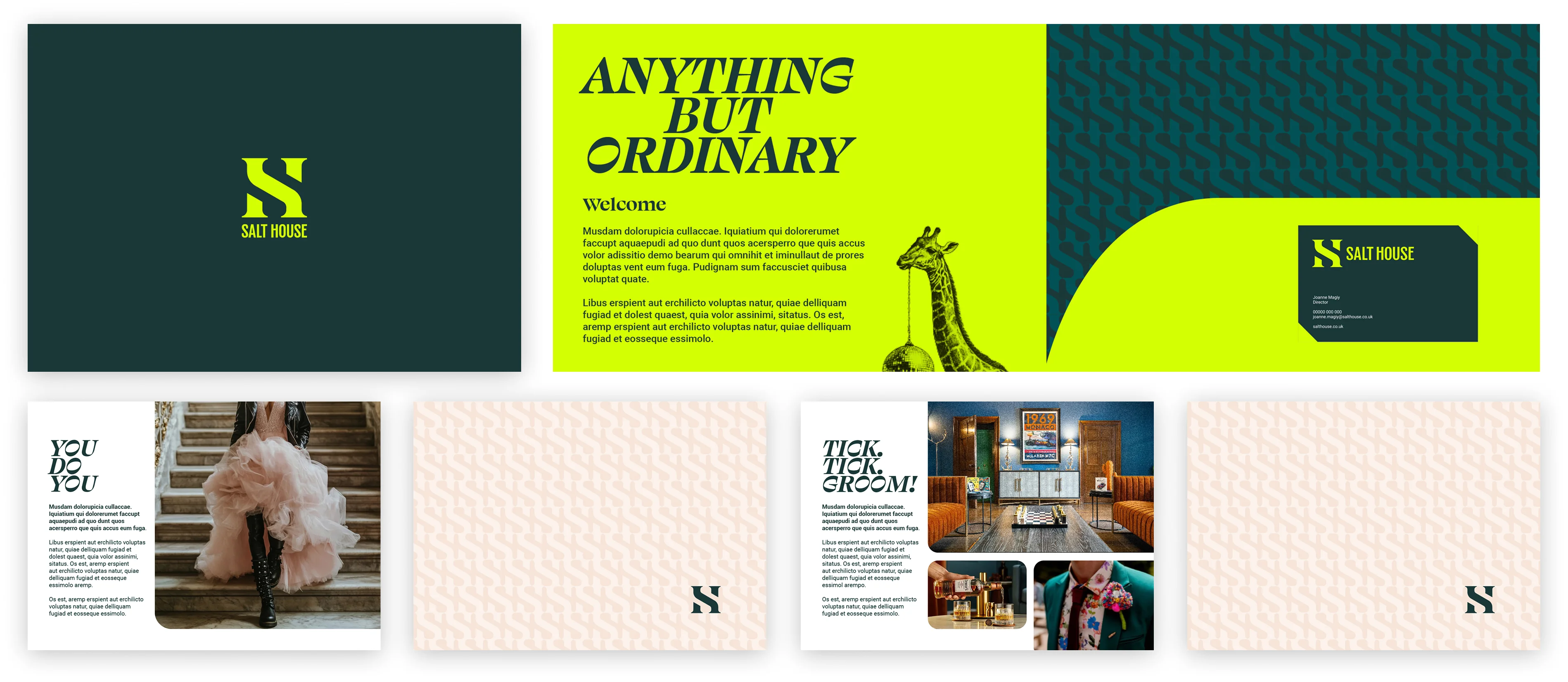
Brochure:
Salt House lives loud online. Their social templates were designed to feel like the brand speaking directly through the screen — bold type, generous spacing, and a consistent visual rhythm that cuts through the noise.

What’s a Rich Text element?
The rich text element allows you to create and format headings, paragraphs, blockquotes, images, and video all in one place instead of having to add and format them individually. Just double-click and easily create content.
Static and dynamic content editing
A rich text element can be used with static or dynamic content. For static content, just drop it into any page and begin editing. For dynamic content, add a rich text field to any collection and then connect a rich text element to that field in the settings panel. Voila!
How to customize formatting for each rich text
Headings, paragraphs, blockquotes, figures, images, and figure captions can all be styled after a class is added to the rich text element using the "When inside of" nested selector system.


